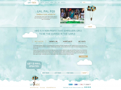
Non-profit organizations generally operate on a tight budget with majority of the funds acquired geared towards charitable distributions. Occasionally such goodwill often leaves the organization strapped for cash and in the process limits their potential to explore other avenues, in particular the online world. One such organization is Hope by Twelve (http://www.hopebytwelve.org) a Seattle, Washington based institution that focuses on tomorrow’s women. Until recently they navigated through the online environment with a basic WordPress website that was not able to kindle the desire and passion necessary to garner donations.
The Old Site
The original website was built from a free WordPress theme, and was nothing spectacular. It consisted of a simple header with a basic navigation bar accompanied by a featured post. Additionally it had a classic three column design with important information delivered in each column. However, the overall design failed to maintain reader engagement and to add insult to injury it did not embody the organization’s philosophy.
The New Site
At Woodall Design the aim is always to tailor websites to the client’s needs so that it reflects their persona. We worked from a stunning redesign by Kismet Communications. Two distinct sections were also created, one which plays its role in the header and the other assigned to the body. The new appearance featured sky blue clouds which imitate the presence of a calm and reassured non-profit organization. Woodall Design refined the Hope by Twelve’s online presence further by integrating a fully adaptive and mobile friendly child site and goal-oriented design.

Here’s a deeper look into what was accomplished:
- Mobile Theme – The custom them used to develop Hope by Twelve’s new website maintained its integrity on smaller screens. Mobile traffic continues to grow significantly within the technological improvements and as such the changes were taken into account for smart phone and tablet users.
- Modern Design – Unlike a typical website with either row grids or column grids, we chose to use sectional formatting with each section delving deeper into the organization’s work or its philosophy.
- Donation Connection – In order to encourage visitors to donate tiny amounts online, Woodall Design implemented a video representation of the organization’s benefactors. Additionally, an email update section was added right beneath the video testimonial to attract more subscribers.
- Project Section – An entirely different section details the various projects undertaken by, Hope by Twelve. With its own page, visitors interested in learning about projects currently underway and those yet to start can now spend hours researching and gathering information directly from the website rather than calling or visiting the organization’s physical location.
- Email Templates – Newsletters are an important method used by NGOs to keep subscribers interested in their endeavors and fuel passion among non-subscribers. As such we ensured that the email templates for the website match the same design elements used on the site.
- GirlPods Section – This section was designed to inspire young girls wanting to make a difference in the world to do something. It is an exclusive section we made keeping in mind the target audience’s young age and their desire to help girls much like them.
- Greater Security – The website now features the latest security measures and protocols to defend against hackers and unscrupulous agencies determined to undermine the work of such socially beneficial organizations.

